Depop
Rebuilding community on Depop
3 min read
Context
Depop has the audience. It's missing the infrastructure to activate them.
Depop is a global secondhand marketplace with 43.5M+ users since 2011, driving the rise of resale culture. As design lead, I chose Depop because its core identity — social, community-driven resale — was underserved by its own product.
Scale
43.5M+ users, active since 2011.
Cultural Moment
Resale culture is growing faster than the platforms serving it.
The Gap
Depop has the audience, but not the infrastructure to activate them socially.

Discover
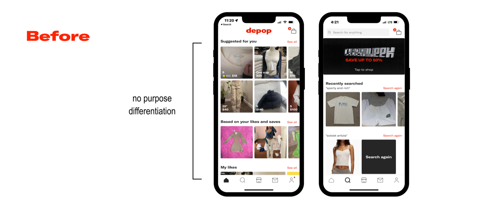
Depop wins on feel. It loses on structure.
We benchmarked Depop against six major resale platforms to see where its strengths could be extended, and where structural gaps existed.
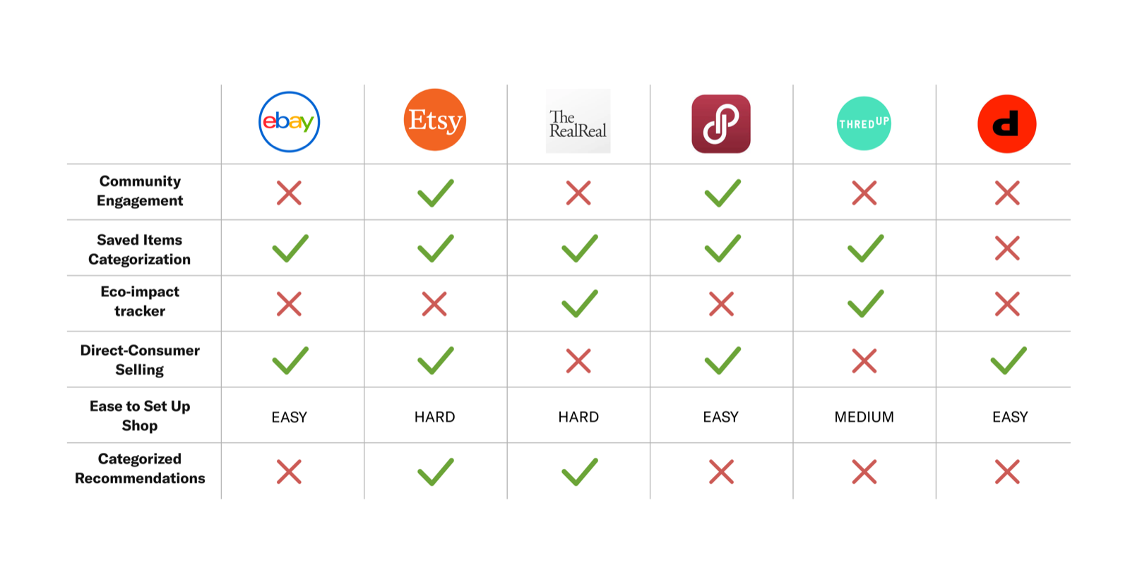
Depop stands out for its social media feel and the ease of shop setup, but lacks structured personalization across discovery and recommendations.
Research
Users trust people, not sellers.
To understand shopping habits and style inspiration, we ran surveys with 92 people and interviews with 10 college students, then used affinity mapping to find where friction lived: community engagement, the buying process, and product discovery.

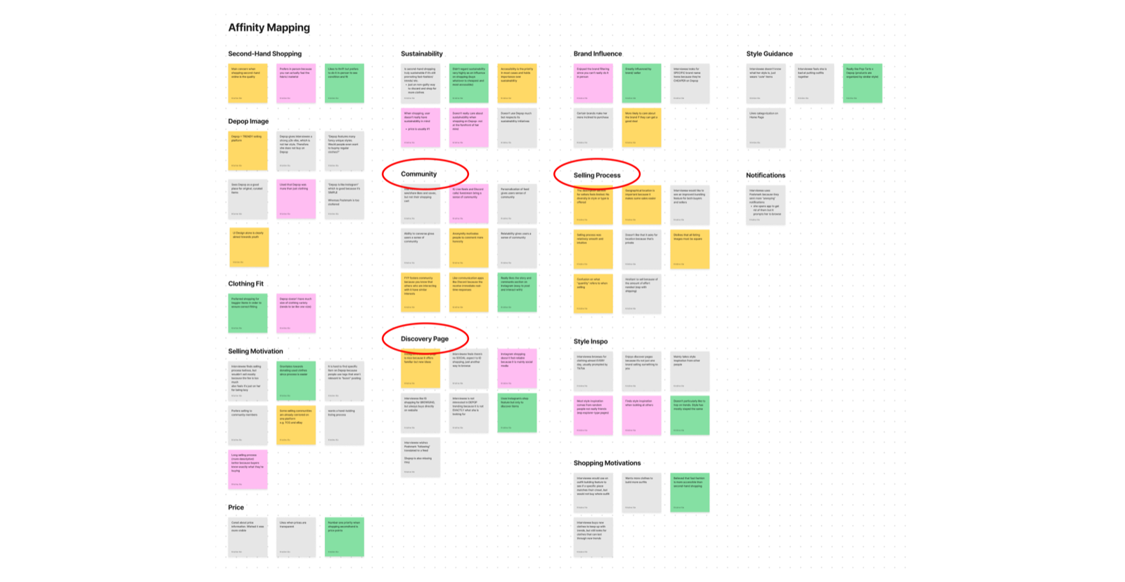
Users rely on social connection for both purchase confidence and fashion inspiration.
Trust Barrier
Users hesitate to buy from sellers they don't trust.
Inspiration Source
Style inspiration comes from friends and influencers, not algorithms.
Platform Gap
Depop is built around people, but does little to connect them.
Define
How might we increase community engagement by personalizing discovery and streamlining the listing process?
This framing addressed two levers at once: personalized discovery makes buying from strangers feel lower-risk, while streamlined listing reduces seller friction and grows inventory.
Community
Accessible points of interaction foster community.
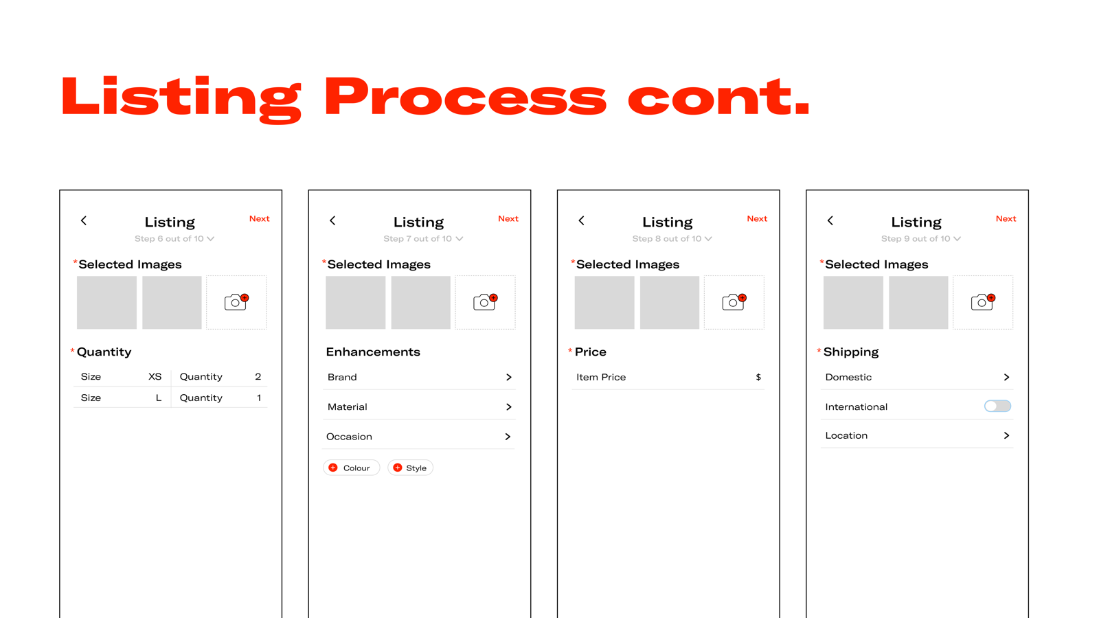
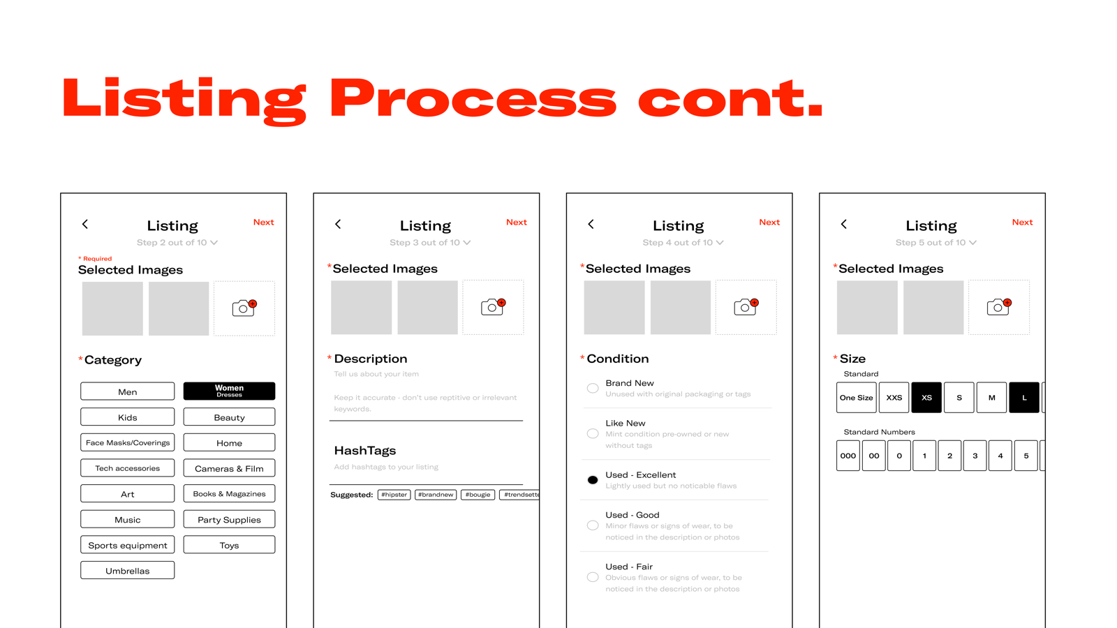
Streamlining Listings
Sellers need speed; buyers need structured condition data. Clear information serves both.
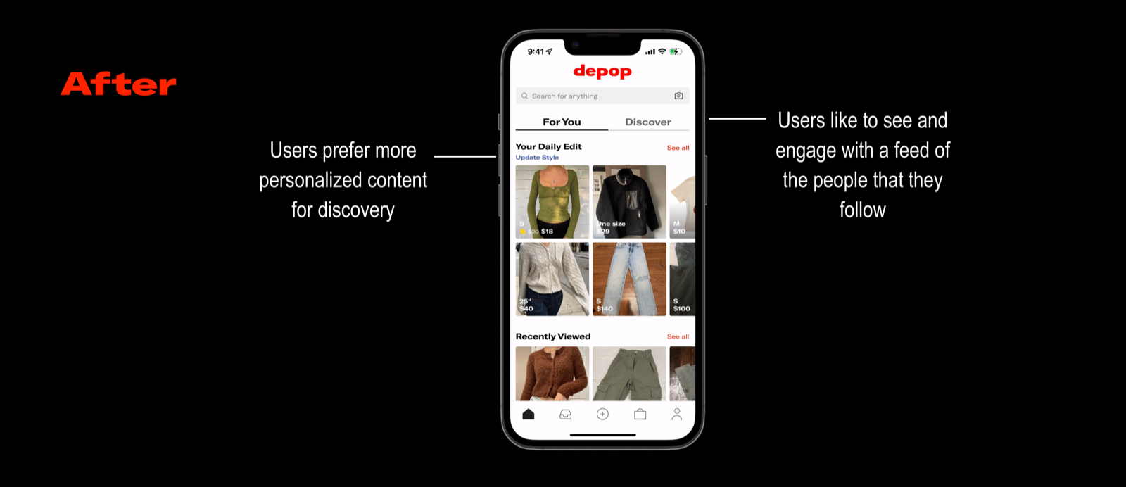
Personalizing Discovery
Discovery was inherently social, not algorithmic. Users wanted curated feeds from people they already followed.
Insight: strengthening community trust can improve discovery and purchase confidence at the same time.
Develop
Every screen had to serve two goals at once.
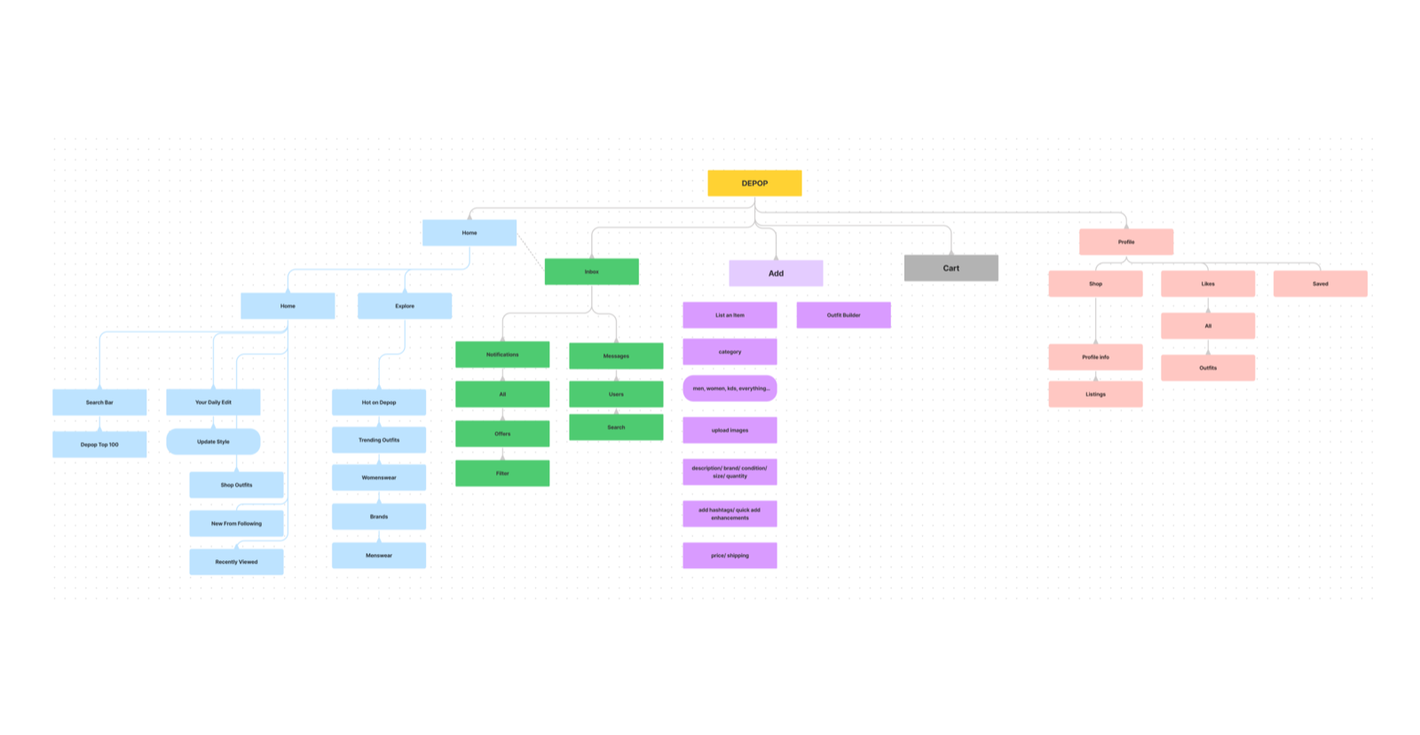
We mapped the information architecture to support both a streamlined, transparent selling experience and a discovery layer grounded in community.
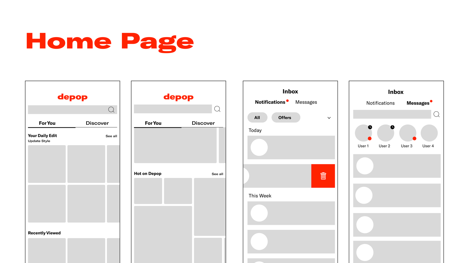
Home
Trending content and a personalized daily edit.
Explore
Category and trend-based browsing.
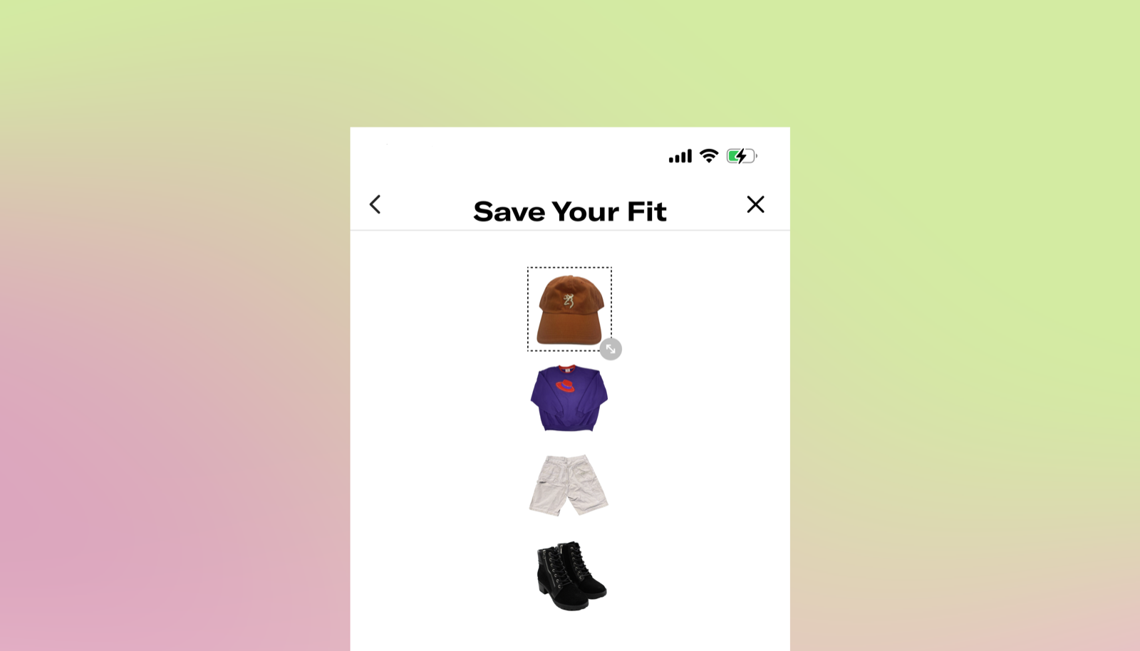
Add
Guided listing flow and outfit builder.
Account
Profile, liked items, and saved outfits.
Prototype
Five designers. One screen. Five different answers.
To avoid groupthink, I had each team member sketch every screen independently before we converged, surfacing assumptions we didn't know we were making.
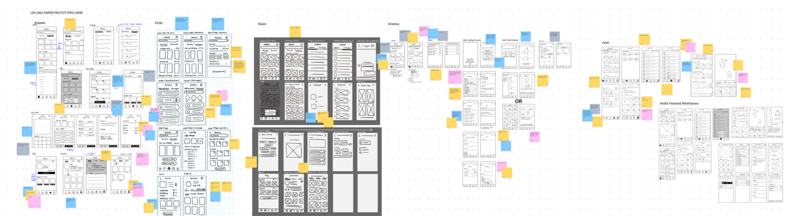
Outfit Builder became a way to make listing faster while giving buyers richer style context.
Solutions
We rebuilt for one insight: trust drives conversion.
Rather than beautifying existing flows, we restructured them around a single core insight: community trust is what drives purchase confidence on Depop.