Chase Pay Monthly
Making travel dreams affordable
5 min read

Context
Chase customers want to travel. Most can't afford to pay upfront.
Chase's Alternative Lending team identified a $1.2T opportunity in travel BNPL by 2030, and a gap in the market: no premium financial product designed specifically for travel financing within an existing banking ecosystem.
Strategic Opportunity
Expand lending beyond traditional card products.
Design Challenge
Communicate interest, fees, and a fluctuating final payment without overwhelming users.
Our Constraint
Chase customers expect premium, trustworthy financial experiences.
Problem
High travel costs force a false choice.
High travel costs force customers into a false choice: delay the trip, compromise the experience, pay in full, or redeem points they may have been saving for something else. Traditional payment options don't meet customers where they are financially.
The core challenge: integrate a contextual BNPL solution into Chase Travel while making a complex, unfamiliar product feel clear, trustworthy, and manageable. Unlike typical BNPL offerings, Chase Pay Monthly carried interest, fees, and a fluctuating final payment, so transparency had to be built into every step without overwhelming users.
Discovery
Customers don't think in totals. They think in thresholds.
Through 1:1 concept testing across nine installment variations, one insight reframed the entire product direction.
Customers evaluate financing through a personal "debt comfort zone," a mental threshold that shapes their willingness to adopt installments, sensitivity to interest, and expectations for transparency.
This single finding drove our product definition, audience targeting, and every information hierarchy decision that followed.

Solution
Pay Monthly wins when control matters more than rewards.
Debit-heavy users
Prioritize predictable monthly payments over rewards earning.
Financial planners
Want to know exactly what they owe and when.
Reluctant travelers
High travel intent, blocked by upfront cost.
The Task
Clarifying the loan management experience.
My teammate Susie and I owned the loan management experience, specifically the Details screen, the central hub where customers would track, understand, and act on their loan.
Interest-bearing
Unlike most BNPL, this loan accrued interest.
Fee-bearing
Late and processing fees added complexity.
Fluctuating final payment
The final payment amount could change, and customers needed to understand why.
Research
Three rounds. Each one sharpened a different question.
Round 1
Concept Testing
What do customers expect from a loan details page?
Round 2
A/B Testing
Which design approach best supports comprehension and payment management?
Round 3
Usability Testing
Does the final design hold up under real edge-case behavior?
Round 1
Customers don't want more data. They want the right data.
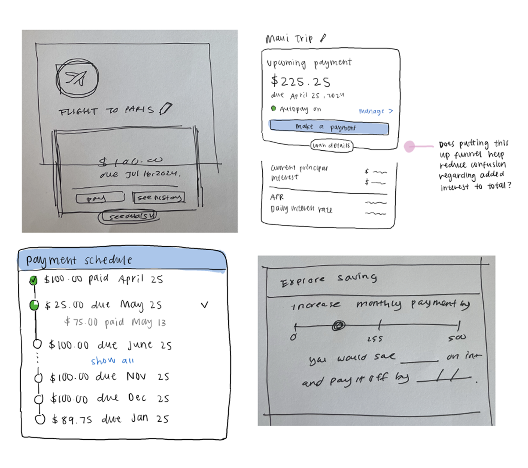
We benchmarked across BNPL, auto loan, and mortgage experiences to understand what core elements users expect, then focused on where Pay Monthly diverged most: payment schedules and interest accrual.
We designed four concepts of the Details page to test the right information altitude. Then we ran a buffet-collaging exercise, letting customers compare at the component level and assemble their ideal page.
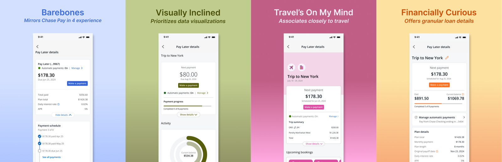
Travel context matters
Showing trip details reinforced the loan's purpose and built excitement.
Numbers overwhelm
Customers didn't need a principal-to-interest breakdown; total payment amount was enough.
Dates and amounts first
Due dates and payment amounts were non-negotiable; source account visibility built trust.
Data visualizations added cognitive load without improving comprehension. We cut them entirely.
Round 2
Detail beat simplicity when the stakes felt real.
We tested two versions across three real scenarios: on-time payments, late payments, and partial payments.
Version A
Version B
Emphasis
Visual cues and iconography.
Content depth and customization.
Tracker style
"Subway style" — next and last payments foregrounded.
Completed payments foregrounded.
Extras
Completed payments hidden.
Tooltips and interest calculator included.
Version A
Visual cues and iconography.
"Subway style" — next and last payments foregrounded.
Completed payments hidden.
Version B
Content depth and customization.
Completed payments foregrounded.
Tooltips and interest calculator included.
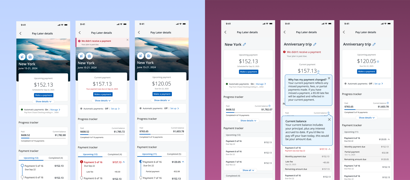
The image was the surprise
Trip destination and dates were the most essential header content, but the photo was what created genuine delight.
Ambiguity calls for boldness
In moments like a missed payment, customers wanted bolder, more detailed UI, not simplified messaging.
Tooltips earned their place
The interest calculator helped customers understand how payments compound, and they wanted it.
Round 3
Comprehension held. Consequences still needed surfacing.
We ran 30 unmoderated usability sessions across four customer scenarios — net-new, late payment, overpayment, and completed — to see if the design held up under real financial decision-making, not just comprehension.
Net-New
97% found the payment schedule easy to navigate — but 9 of 30 confused remaining balance with total payoff
Late Payment
The red alert banner drew attention immediately — but 10 of 30 missed their final payment change
Overpayment
Payments were easy to make — but only 21 of 30 connected an overpayment to its effect on their final payment
Completed
Nearly everyone was delighted by the completion moment — though the completed state still surfaced now-irrelevant content
Across all four scenarios, base comprehension was strong — but the design still needed to proactively surface financial consequences, rather than waiting for customers to go looking for them.
Delivery
The final details page balanced clarity, compliance, and control.
After multiple rounds of research, iteration, and stakeholder alignment, we arrived at the Details page. Each component reflects a balance between user needs, business requirements, regulatory constraints, and design system realities.
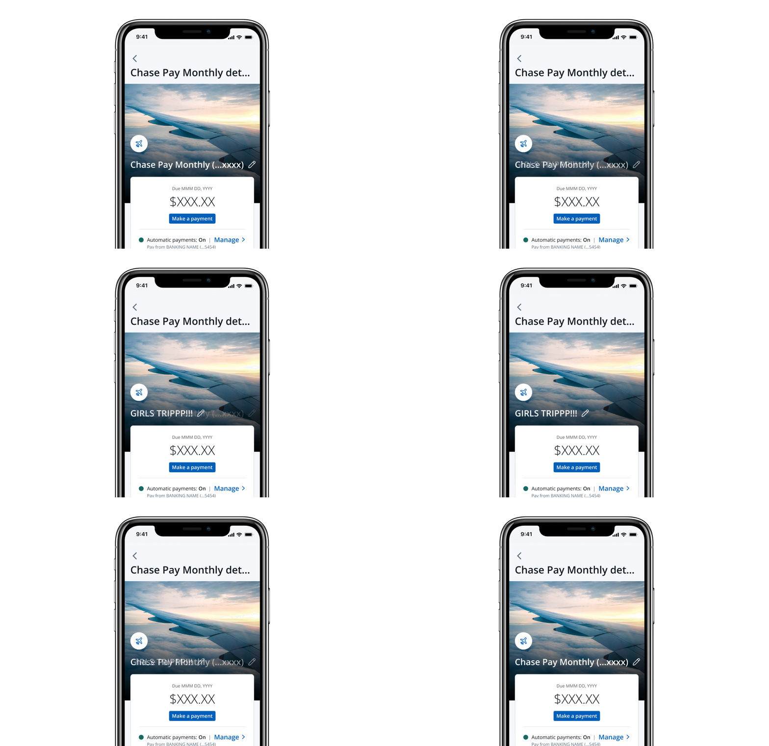
Plan name customization
Customization reassured customers that they were managing the correct plan and made dashboard identification easier.
Details when needed
Plan details were tucked behind a dropdown because most terms were static and previously accepted.
Payment clarity
Payment schedule and recent activity supported preparation, trust, and final payment comprehension.